Copied!
Rebult
Keyboards
Rebult Keyboards
Brief:
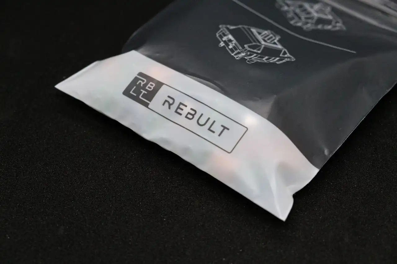
I was approaced by a well-known local keyboard studio in Malaysia to re-design a logo to be minimalistic,
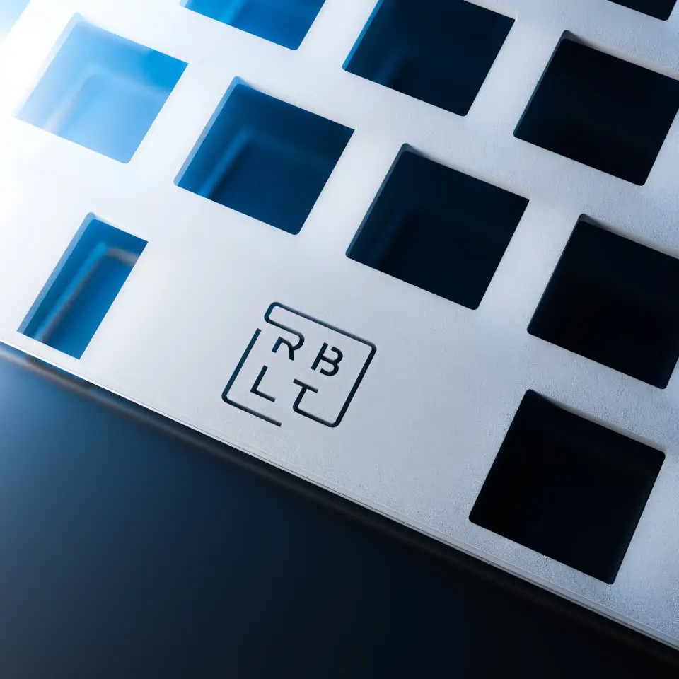
industrial, and CNC-machinable on products.
Design Process:
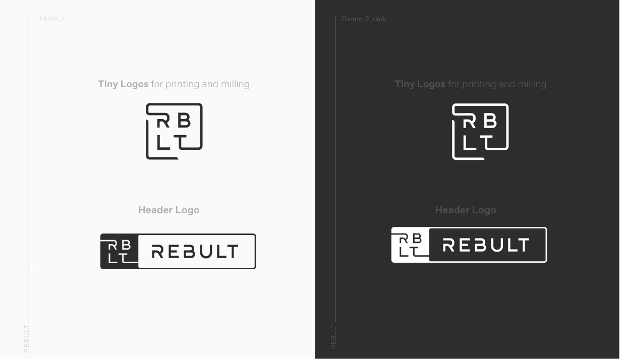
To keep it minimalistic, readable and recognisable, I stuck with the normal Latin fonts.
This ensures better recognition of the brand and easy memorisation when customers search for the main letters in search engines.
The R was made to be an iconic symbol for the Rebult brand.
Technical Implementation & Justification:
Designed in Adobe Illustrator.